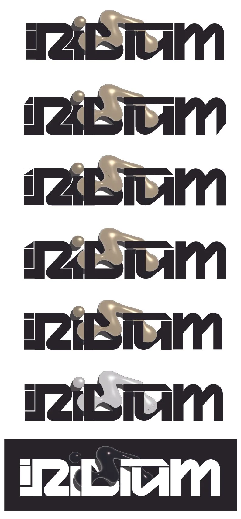
Iridium Logos
While designing the logo for Iridium, my first priority was to conceptualize a visual representation that captured the essence of the brand. I wanted to emphasize Iridium's rarity and versatility, as the product can be applied across a wide range of industries. To achieve this, I set out to create a logo that would convey both luxury and functionality in a sophisticated, high-end manner.
Given that Iridium is a product with a broad potential for use, I was inspired to integrate a dynamic, morphing element into the design. This led me to draw references from the “goop” effect seen in the Venom movies. I envisioned a blob-like shape that could seamlessly morph and transform into the letters “IR,” symbolizing the adaptable nature of the brand. The fluidity of this design element represents Iridium’s ability to take on various forms and functions while maintaining a consistent identity.
For the primary lettermark, I chose to work with a blocky yet futuristic font called Gravity. This font embodies strength and structure, while the sleek, modern lines add a touch of sophistication. The balance between the clean, solid form of the font and the fluid, organic quality of the "goop" element strikes a harmony between luxury and innovation. The overall design aims to evoke a sense of exclusivity and forward-thinking, reflecting the high-end nature of the Iridium brand and its future potential.


